For any subscription plan provider with multiple plans, how the plans are presented can be a deciding factor on which plans customers choose. However, helping users understand what options are available and helping them understand the differences between plans can be challenging. When you then combine the fact that most businesses want to steer customers in a certain direction to select one particular plan, it can be difficult to make an optimal plan selection page and process.
This article will outline a few of the key components of a plan selection page or process and discuss different A/B test approaches and ideas for each.
Number of Options
How many options should be offered depends heavily business to business and can make testing the number of plans difficult. A good general rule though is to offer no more than 4 options.
One approach is to keep it simple and only offer two options. This is a common approach for products with a free vs premium option. It’s a simple choice for users to make, either the free option is good enough or it isn’t and they pay for the premium one. Many businesses though have a need for more plans or tiers than this.
Maybe the most common approach is offering three options. The three-tier approach can work well, especially if pricing is done right, to entice more visitors to jump to the mid-tier option from the cheapest option. Although the three-tier approach does tend to reduce the number of visitors selecting the top tier, the additional users selecting the middle option could make up for it.
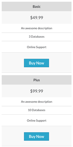
A less common approach is to offer four options. As with the three option approach, offering more plans tends to skew the plan selection from the low end towards the middle. So by offering two middle-tier options, users may be more likely to select higher-priced plans.
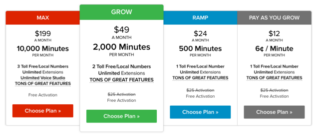
A good example of a simple 4 option plan page.
Comparisons
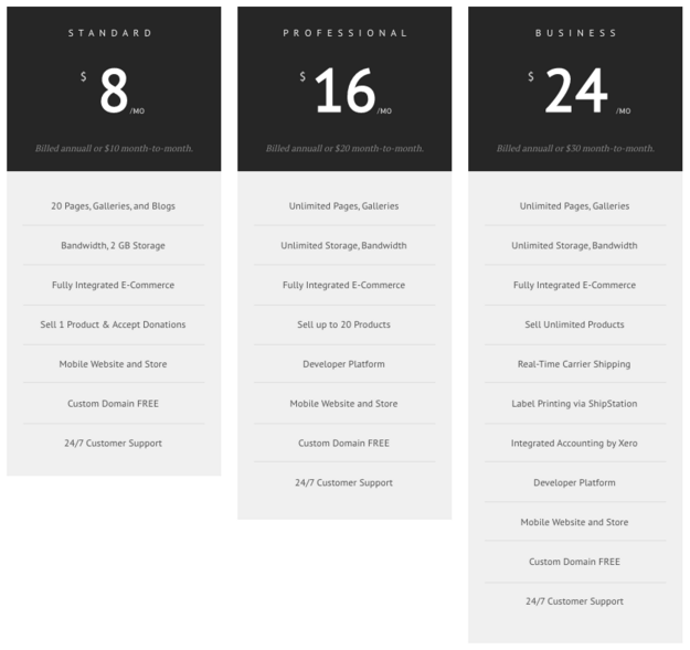
Comparison tables or grids are tricky. Show too many feature comparisons and users get overwhelmed. Show too few and users don’t feel like they have enough info. The goal is to find the right balance between the two. Of course, some of the limitations here will depend on how your product is set up and what the differences between plans actually are.
One important thing to do though regardless of how many features or plans listed is to focus on the differences, not the similarities. It’s good to list a few of the key similarities, but the rest of the feature lists should showcase and emphasize the differences between the plans.
A good rule of thumb here is to keep the difference between plans to between 1 and 5. Usually, the fewer differences there are, the more easily and quickly users can understand the differences and make the right choice. Having more than 5 different features for visitors to scan and compare across multiple plans is too much and can result in users leaving to find a product they can more easily understand.
Test the number of features listed in your comparison tables to find the right balance for your business and offering.
A bad example of a feature comparison grid with too many features and non-standard feature list position.
Highlighting
If you have a few plans, but you really want most users to select one, you can use highlighting to give it more emphasis. This will draw users attention to the plan and make them more likely to select it.
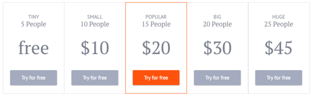
A variation of highlighting is adding a label to one of the plans. Labeling a plan “Most Popular” or “Best Value” will significantly increase the numbers of users selecting it. Make sure your labels are factual, though. Don’t call a plan the “Best Value” when it isn’t.
Quick Note About Mobile Devices
Pricing tables on mobile devices can be tricky. Tablets may not need any design changes, but mobile phones will need a new layout in order to be easily read by users. Standard responsive pricing table behavior should be that the table stacks vertically as shown below.
Defaults
The plan presented as a default selection is usually the plan most users select. That may not be the case if the default selection is 10 times the price of the cheaper plans, but it can work well in cases where relatively minor differences in price or features exist between plans.
Making the decision for users by defaulting to a mid-tier plan could make a big difference. But try defaulting to free plans or even the most expensive plan. The results of this type of test are often surprising.
Another option could be to prominently display just one plan option, and secondarily offer the other plans. Test emphasizing how easy it is to change plans after already making a decision.
If you offer a free or low cost plan, test defaulting everyone into that plan then let users upgrade later when they need the premium features. Removing just this one decision for users to have to think about before they sign up could make a big difference.
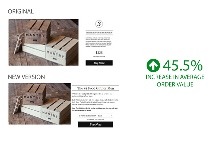
We tested removing the pricing table page and defaulting to a mid-tier plan – average order value increased 45.5%
Instead of defaulting a customer’s plan selection to the cheapest plan, the default selection was changed to the mid-tier offering. Overall, the number of purchases remained the same, yet more customers chose the mid-tier plan, increasing the average order value by 45.5%.